CHROMIC is a research and innovation action financed by the European Commission under the Horizon 2020 Programme. The CHROMIC project aims to develop new processes to recover chromium, vanadium, molybdenum, and niobium from industrial waste, through smart combinations and new technological innovations. This will help reduce the CO2 emissions of metal production and reduce the environmental impact of its wastes.
The project involves five research centers, five industrial partners, and one university from different European countries (Belgium, Germany, France, Slovakia, and Italy). formicablu is the partner in charge of the communication activities, and as for the SMART-map project, they asked me to design the visual identity and the visual assets for both printed and digital applications. In this project I partnered with Roberto Zizza, a graphic designer based in Milan, and working together with him on every phase of the project.
Our work started by analyzing the structure and the aim of Chromic. Metal recovery from industrial waste is a very technical goal, yet it fosters very important societal aspects like sustainability and public trust. The main goal was therefore to develop a visual brand able to appear elegant and technical, but also very friendly and relatable.
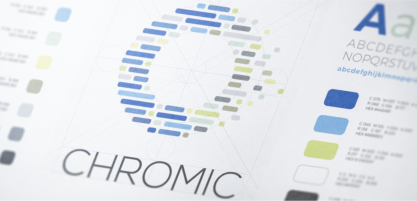
Chromic Visual Identity & Brand Strategy

As part of the research and strategy phase I conducted a market analysis to identify how similar projects, companies and organizations operate in the same sector (metallurgy & metal recovery) and communicate their brands. The result of this work was key to understand how to position the Chromic visual identity and which characteristics to choose for its development.
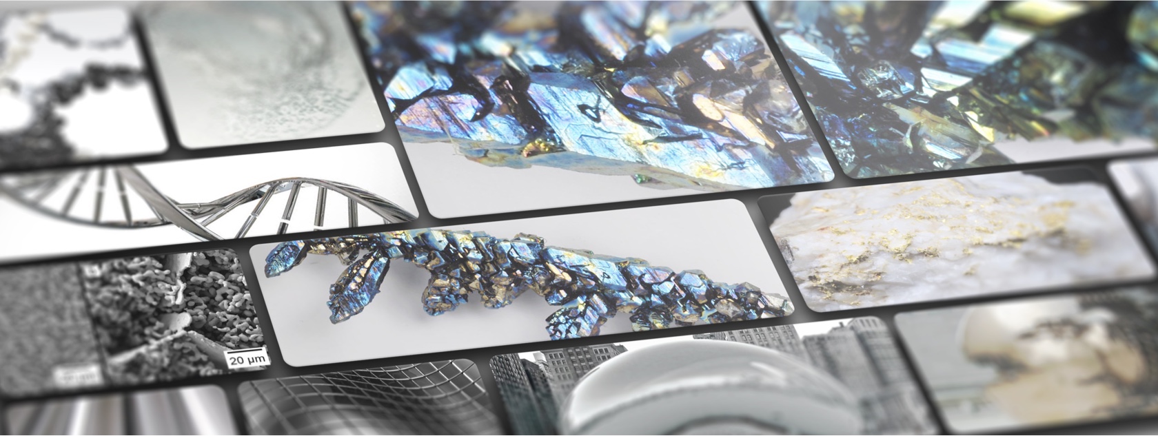
The moodboard
Logo and color palette
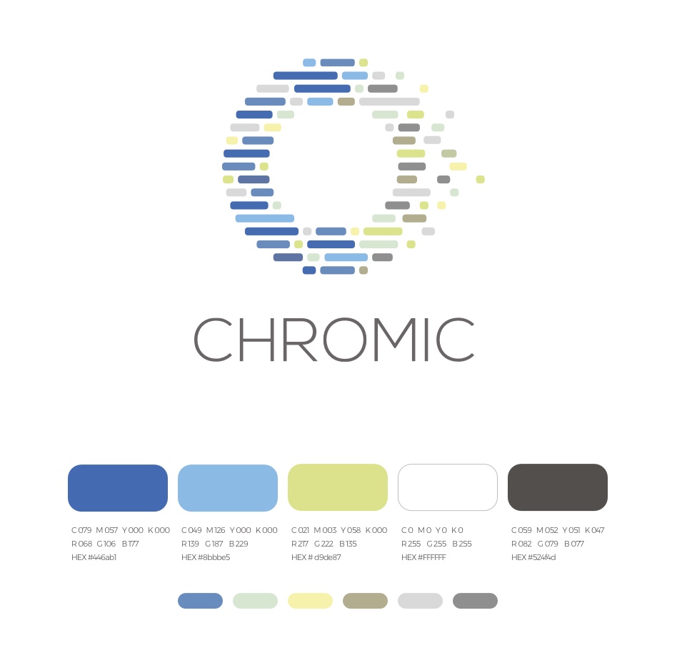
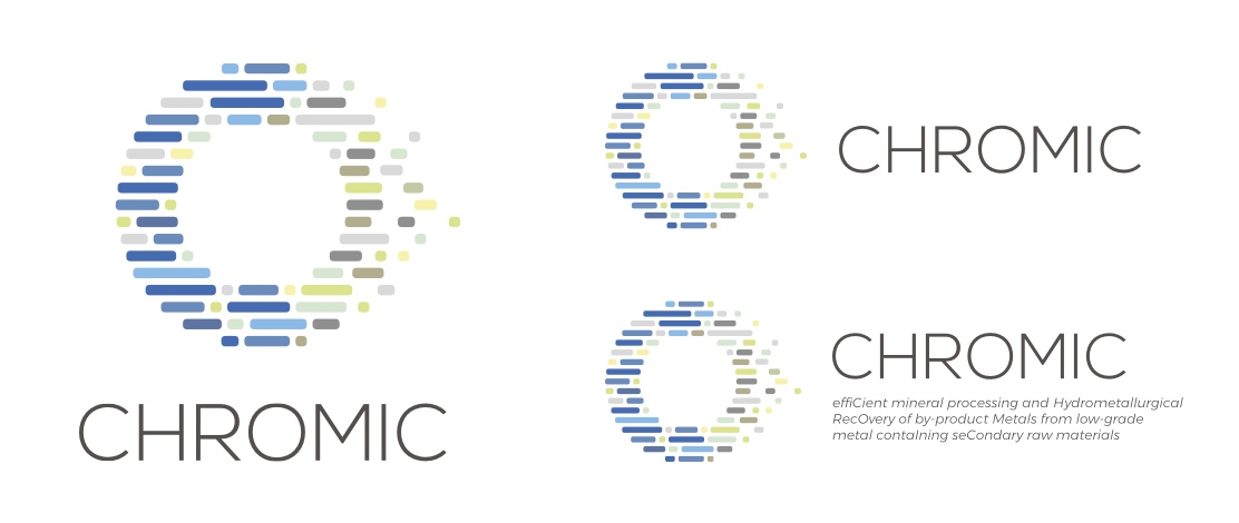
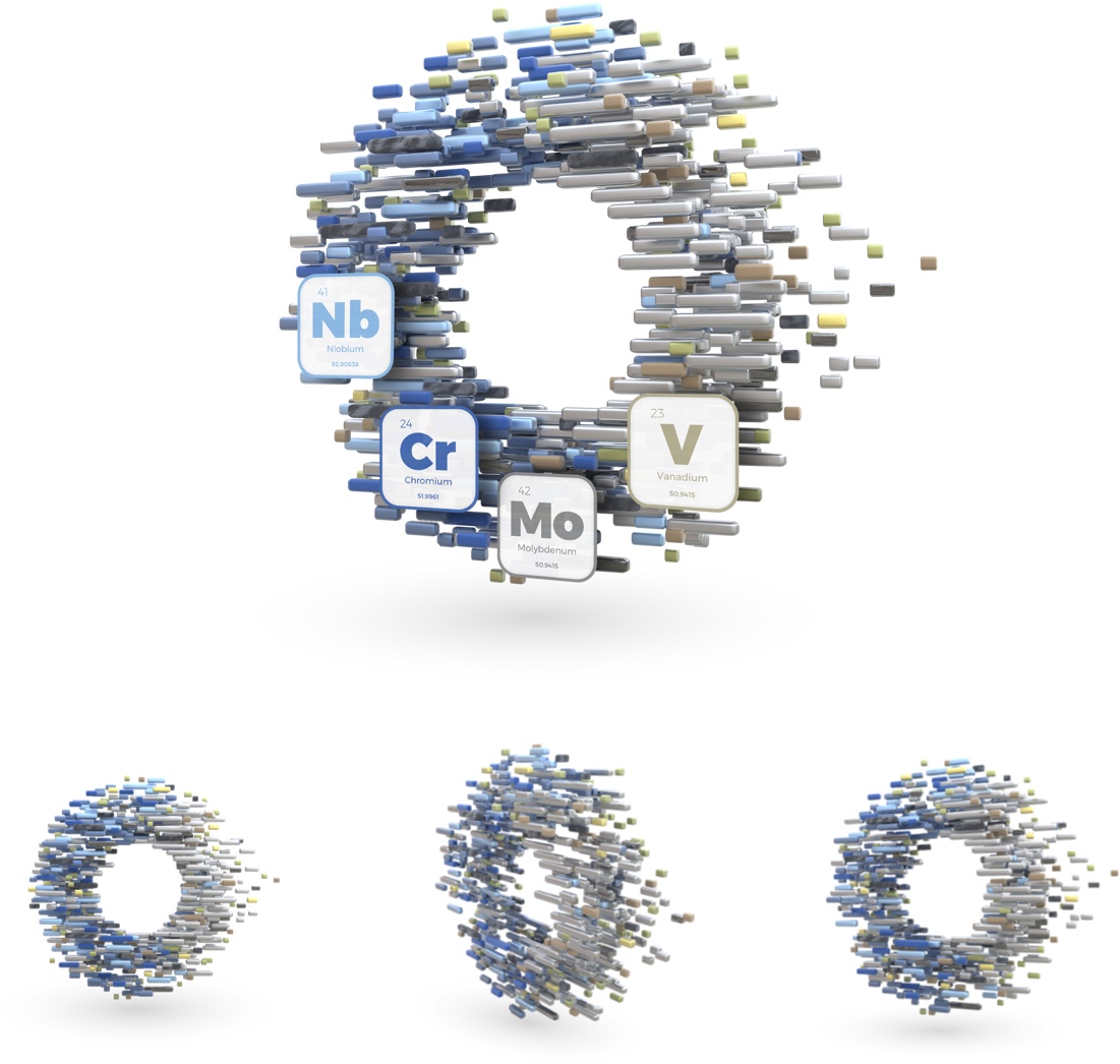
The CHROMIC logo depicts the highly technological and innovative roots of the project by illustrating a process of particle extraction and material separation. Furthermore, with a circular shape and a very characterized color palette, it also suggests more profound (and very fundamental) aspects of the project, such its circular and inclusive approach and its deep commitment to environmental sustainability. The logomark subtly forms a “C” shape with the blue segments in the left side of the circle in order to maximize even more the connection between the logo and the name of the project.
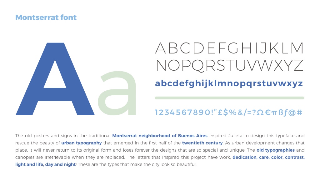
Typeface selection
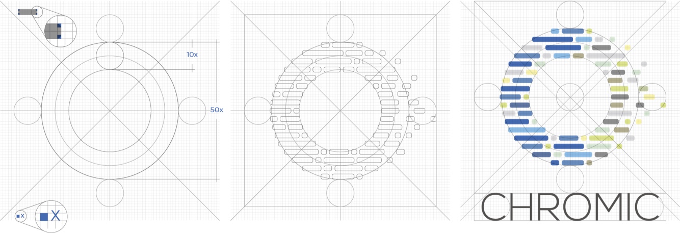
Logo Construction
Logo layouts
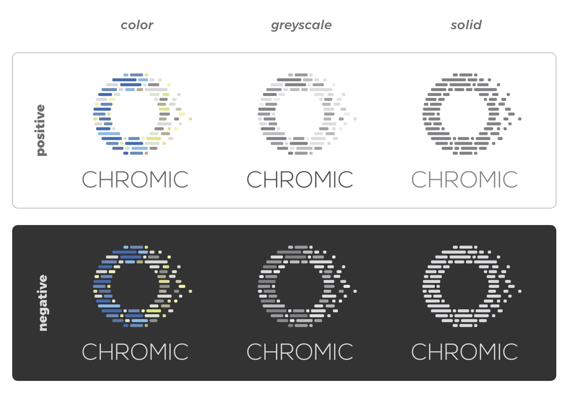
Color schemes
Visual patterns
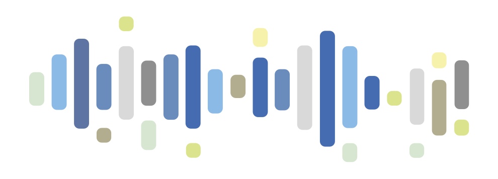
Chromic illustration system
The official Chromic templates
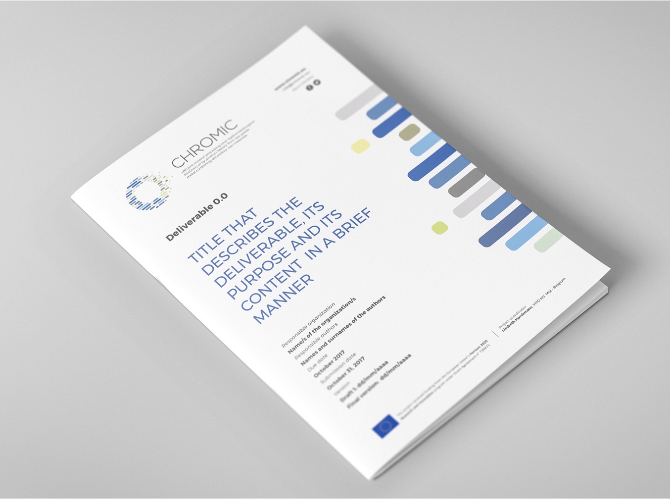
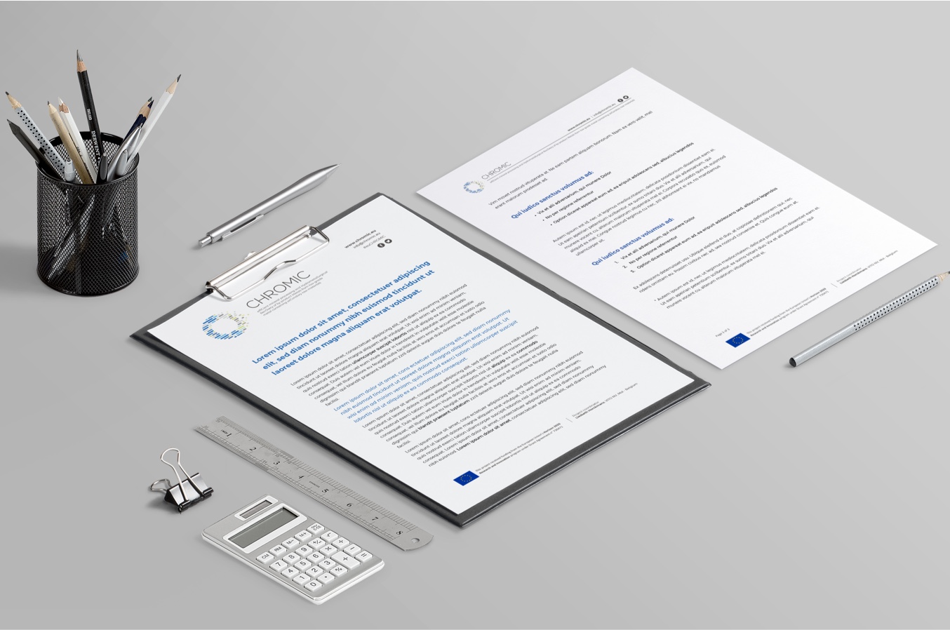
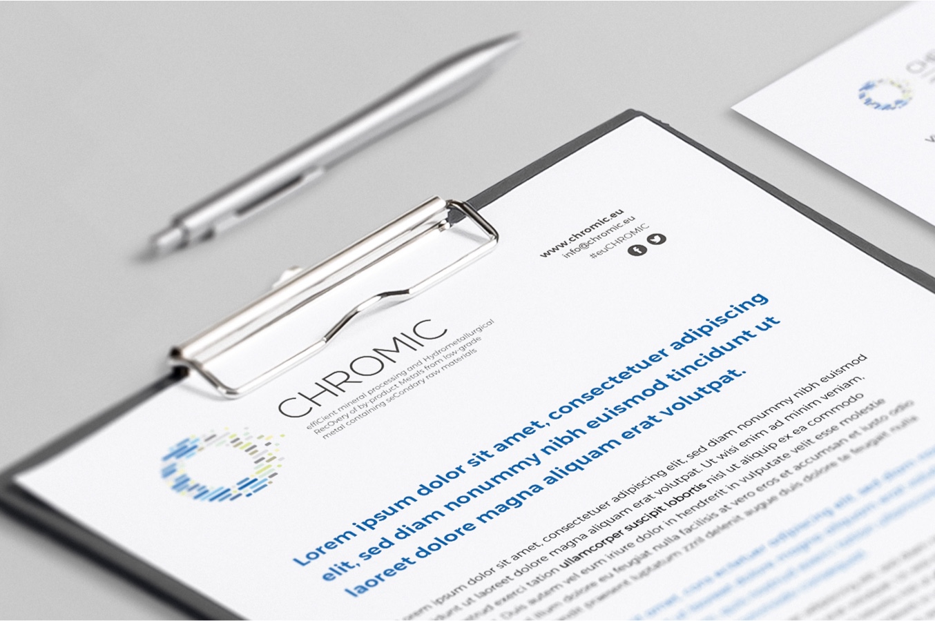
Deliverable & letterhead
Project presentation
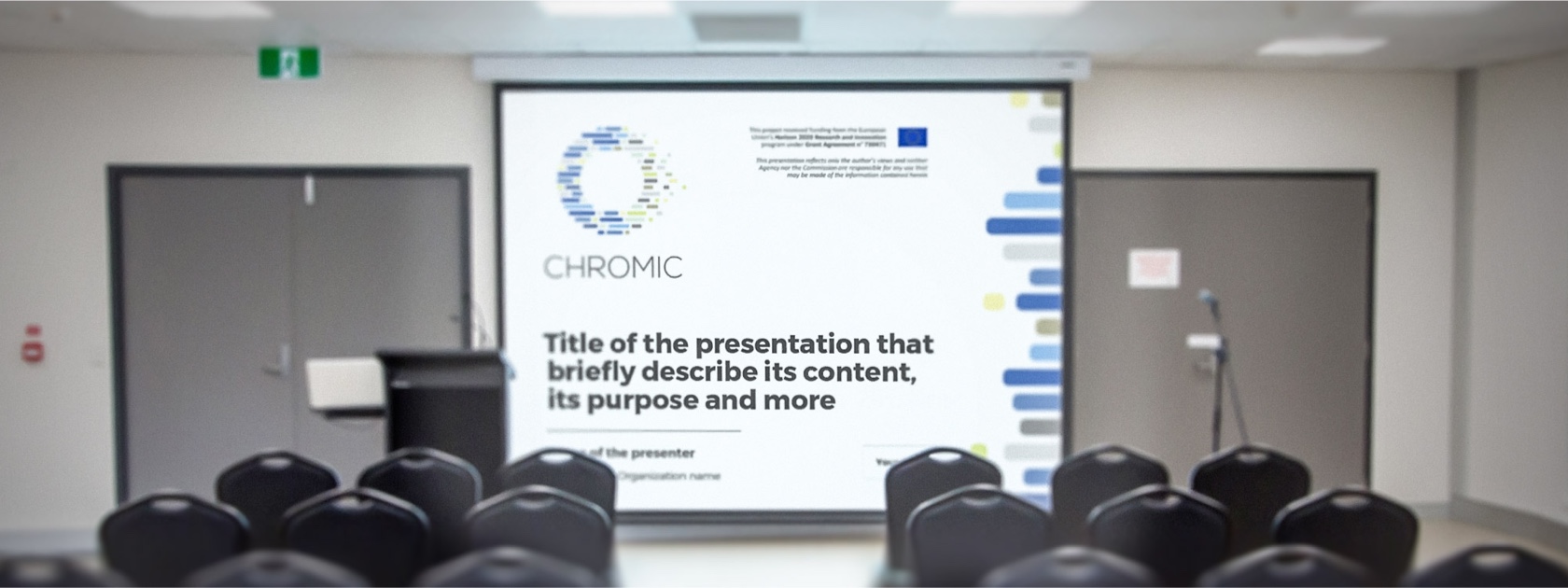
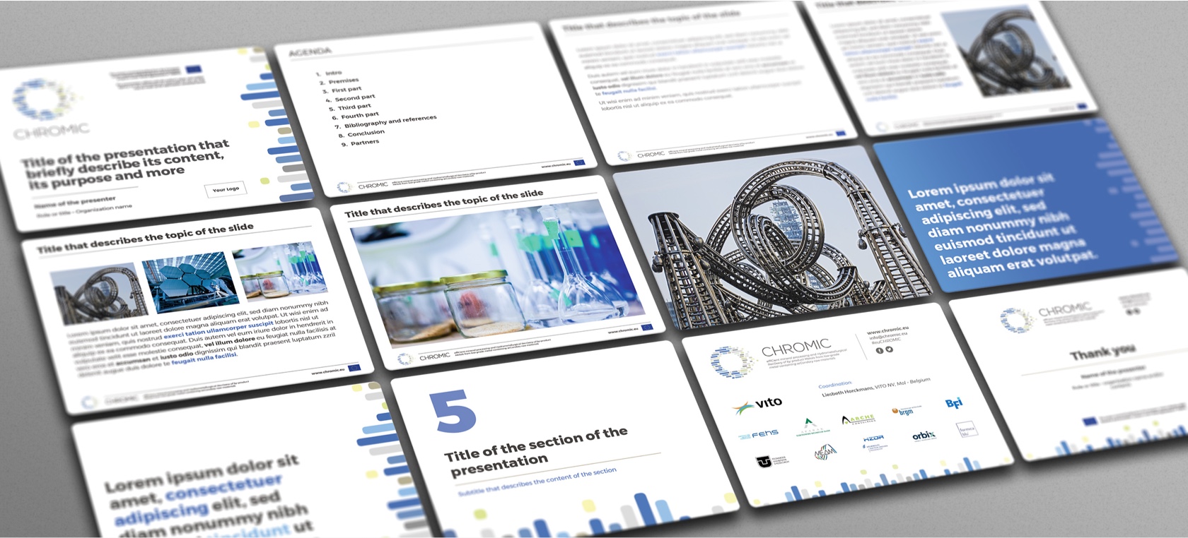
The official presentation of the project along with a fully editable branded template for custom presentations. Both documents were developed with native Powerpoint (.ppt) and Keynote (.key) versions.
Chromic scientific poster template
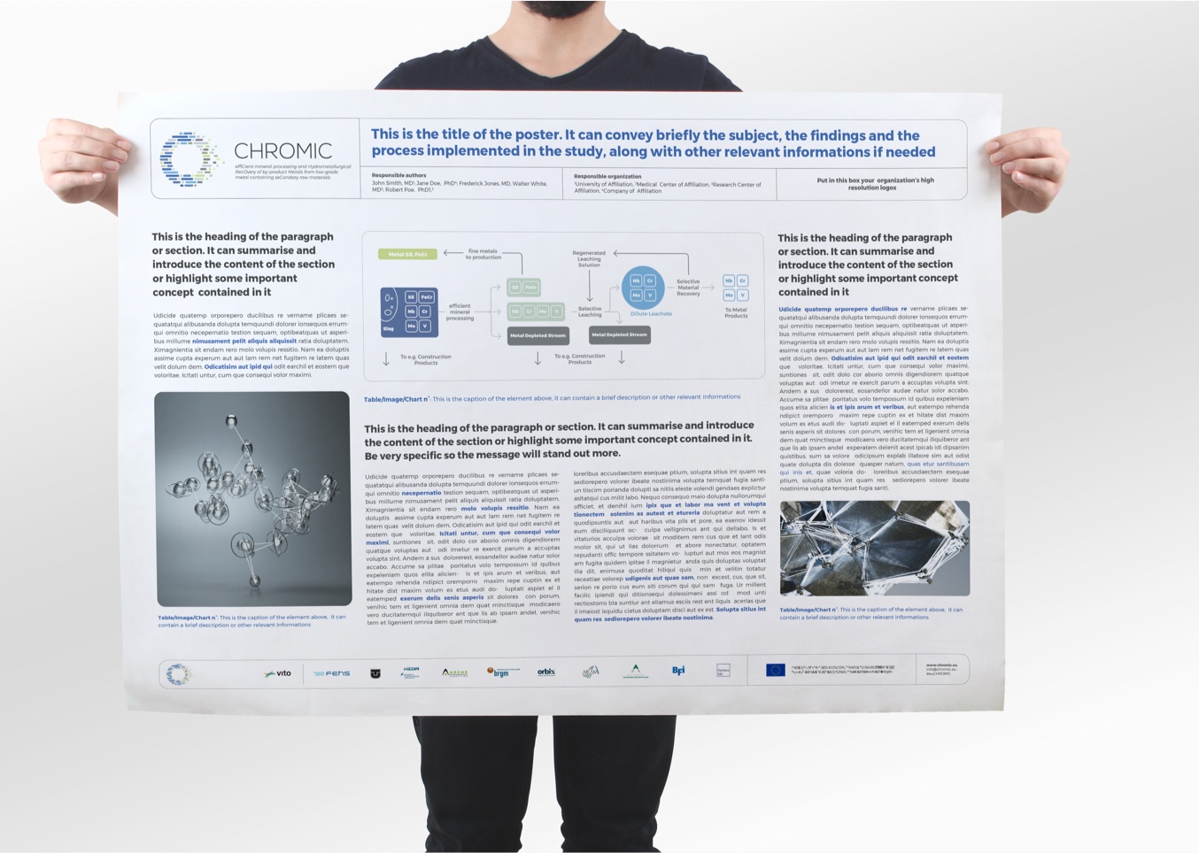
Poster template for Powerpoint and Illustrator
Chromic’s promotional material
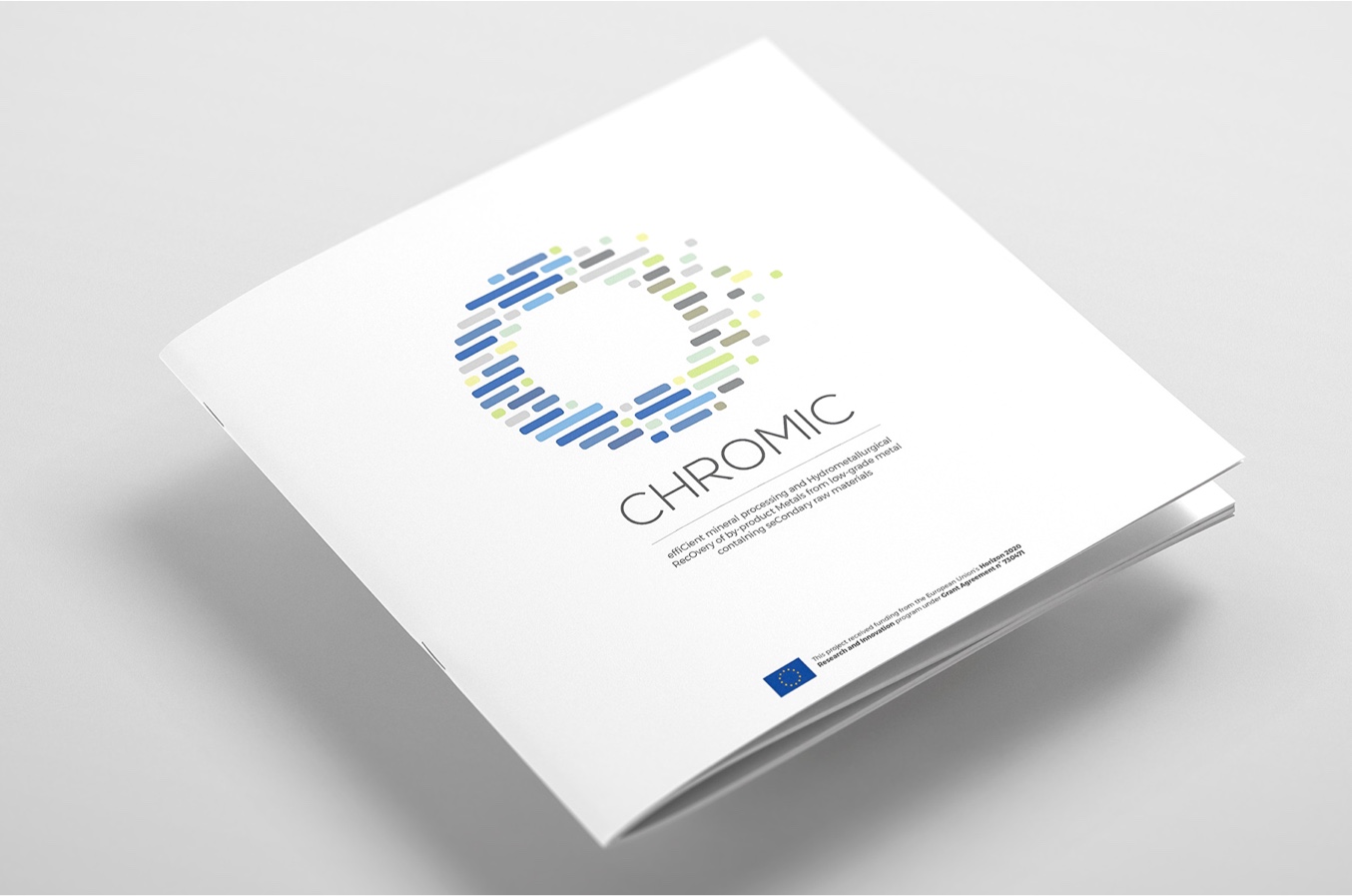
The brochure of the project
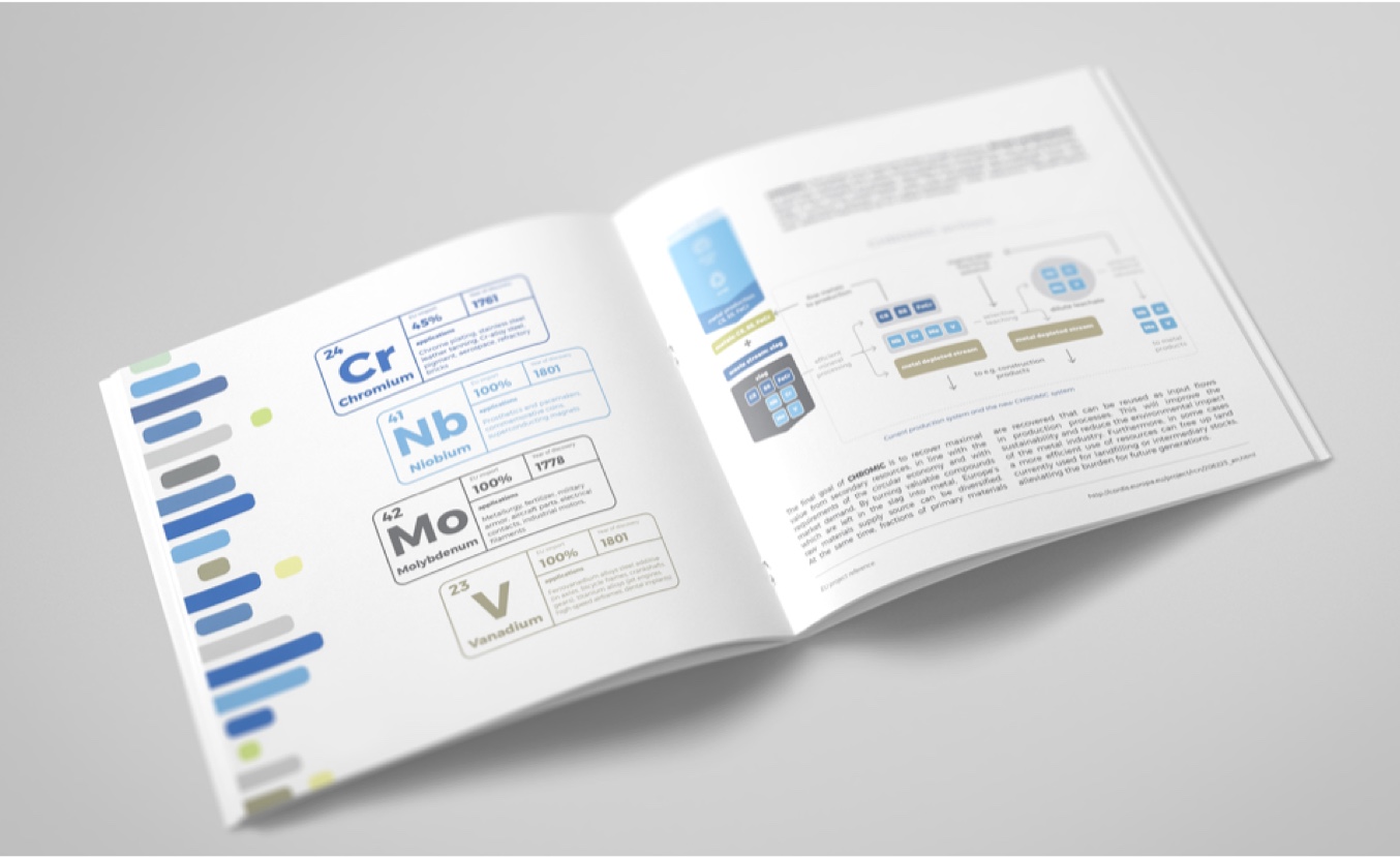
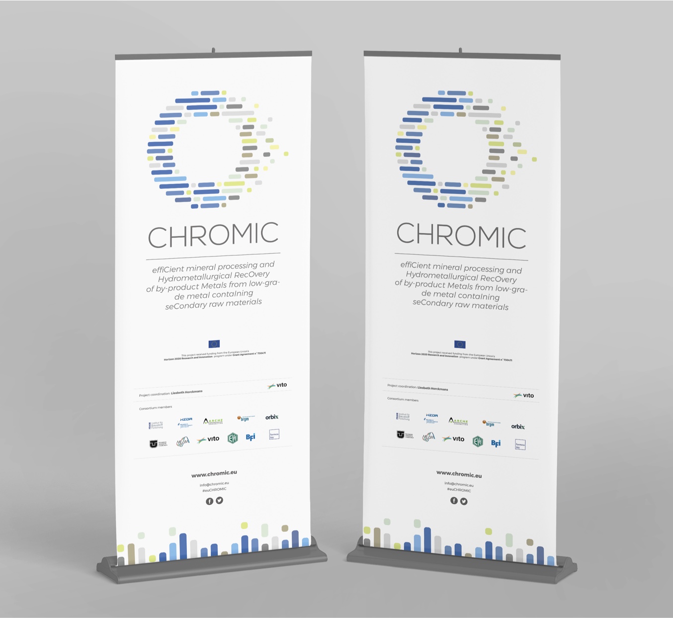
Event and conferences’ roll-up
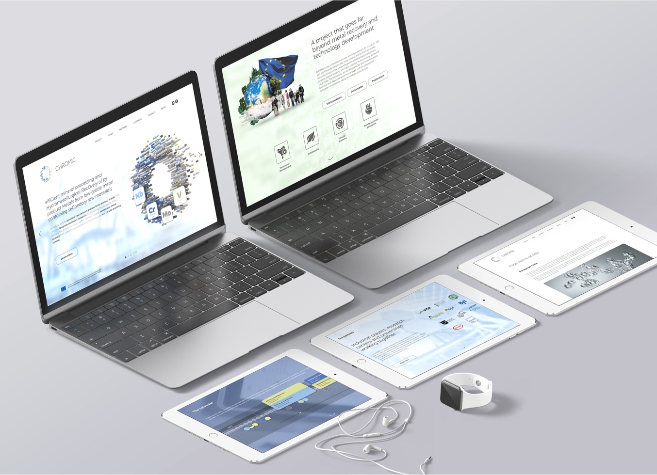
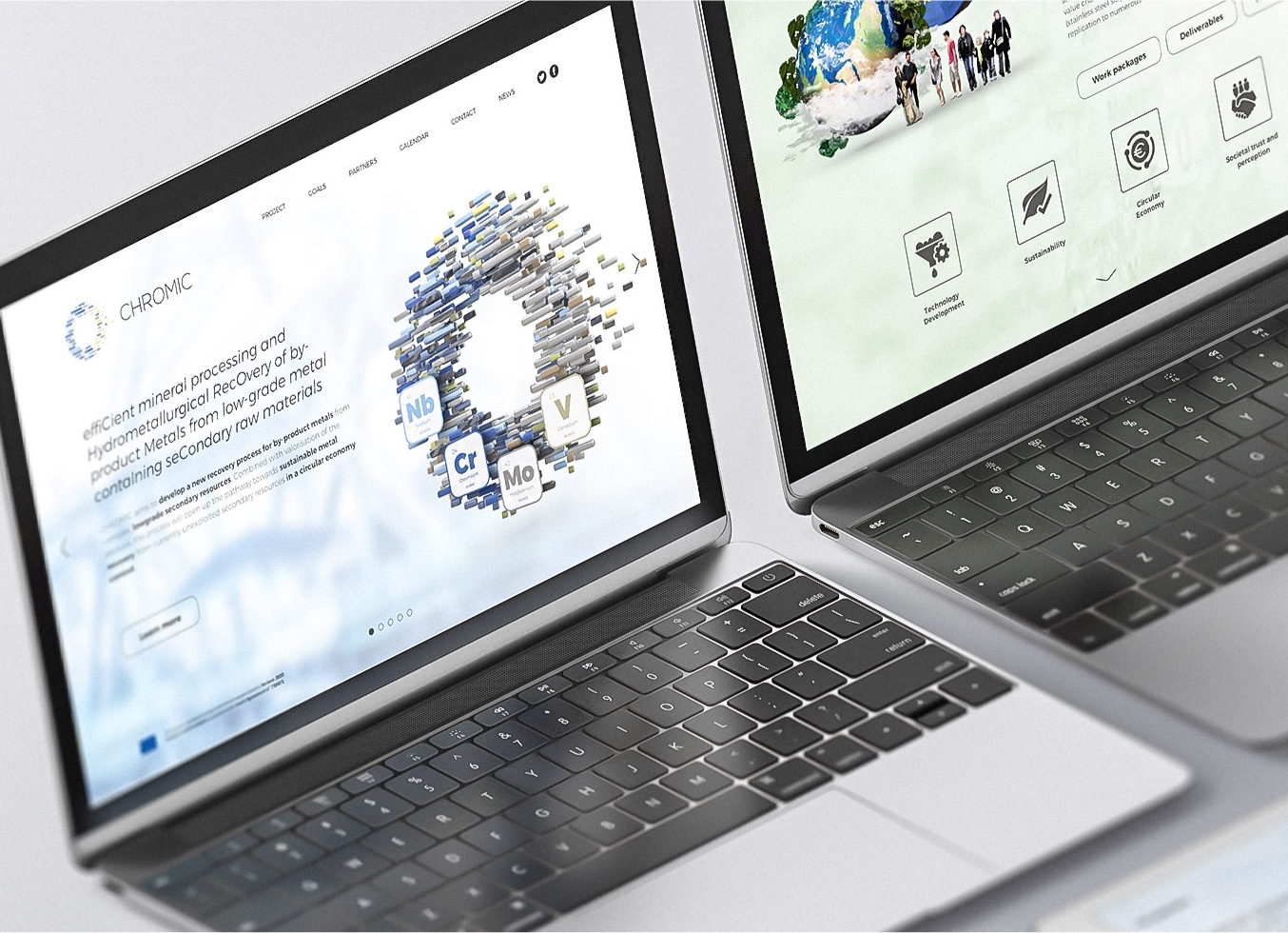
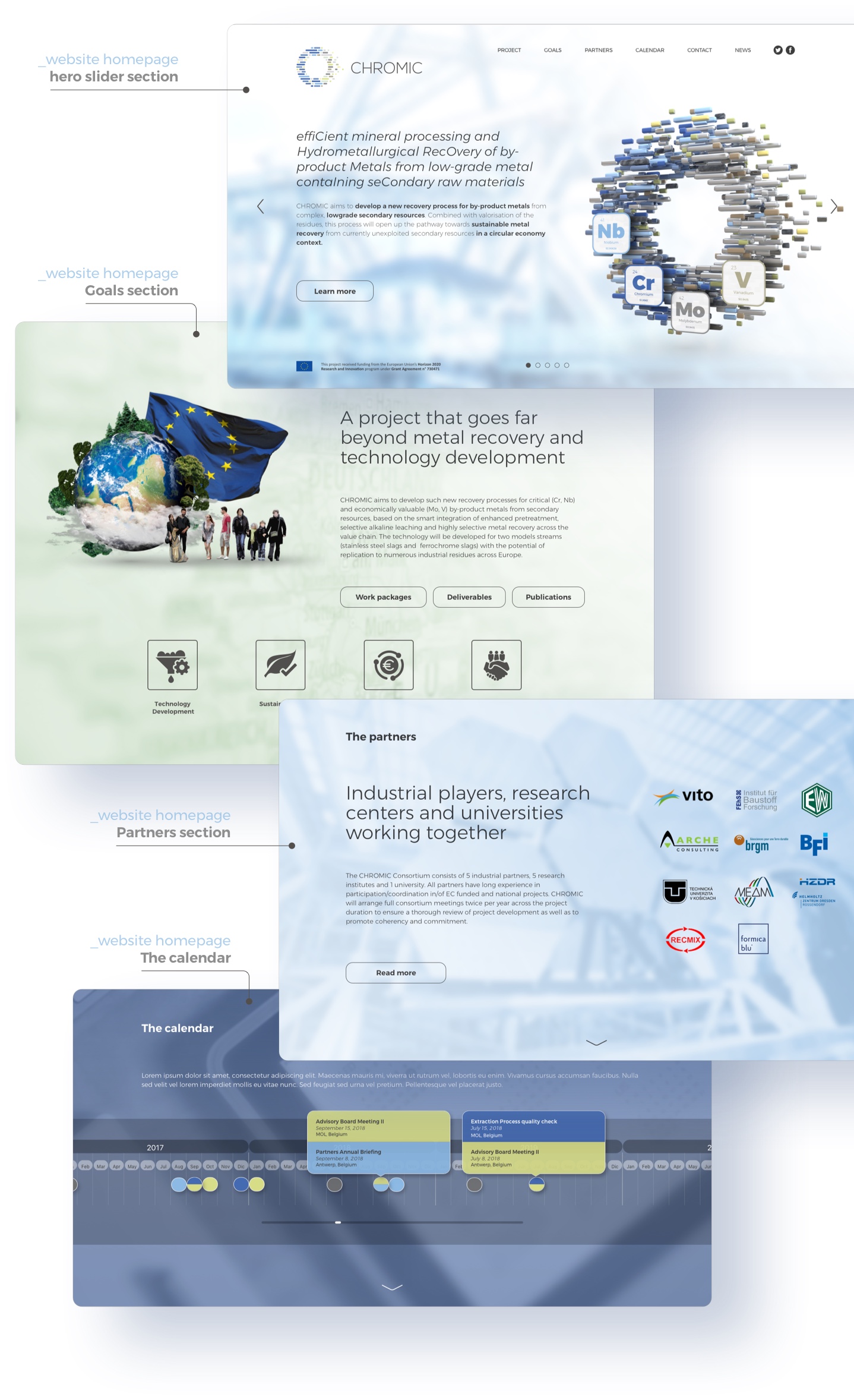
The Chromic official website
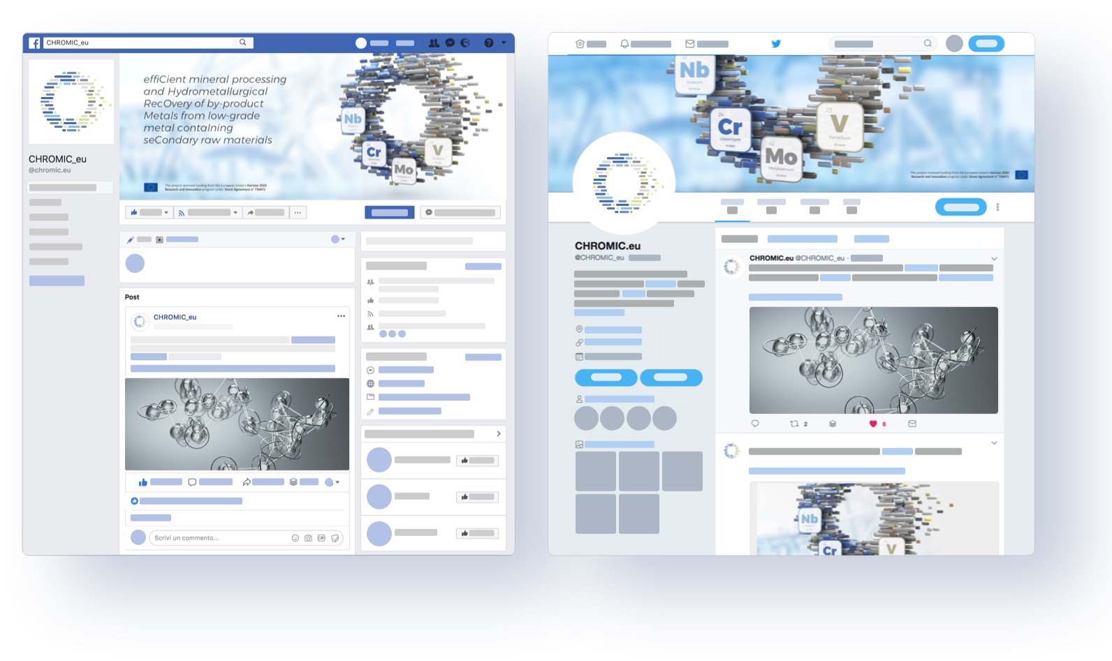
Social media channels
Partners:
- VITO – Belgium vito.be
- MEAM – Belgium meam.be
- Orbix – Belgium wwww.orbix.be
- formicablu – Italy www.formicablu.it
- ARCHE – Belgium www.arche-consulting.be
- TUKE – Slovakia www.tuke.sk
- HZDR – Germany hzdr.de
- BFI – Germany www.bfi.de
- FEhS – Germany www.fehs.de
- brgm – Francewww.brgm.fr
- EWW – Germany www.elektrowerk.de
Project links:
Web: www.chromic.eu
EU reference: cordis.europa.eu/project/
Facebook: facebook.com/chromic.eu/
Twitter: twitter.com/chromic_eu
THANK YOU!
Self-Driving Society
Discover another visual identity & research project
