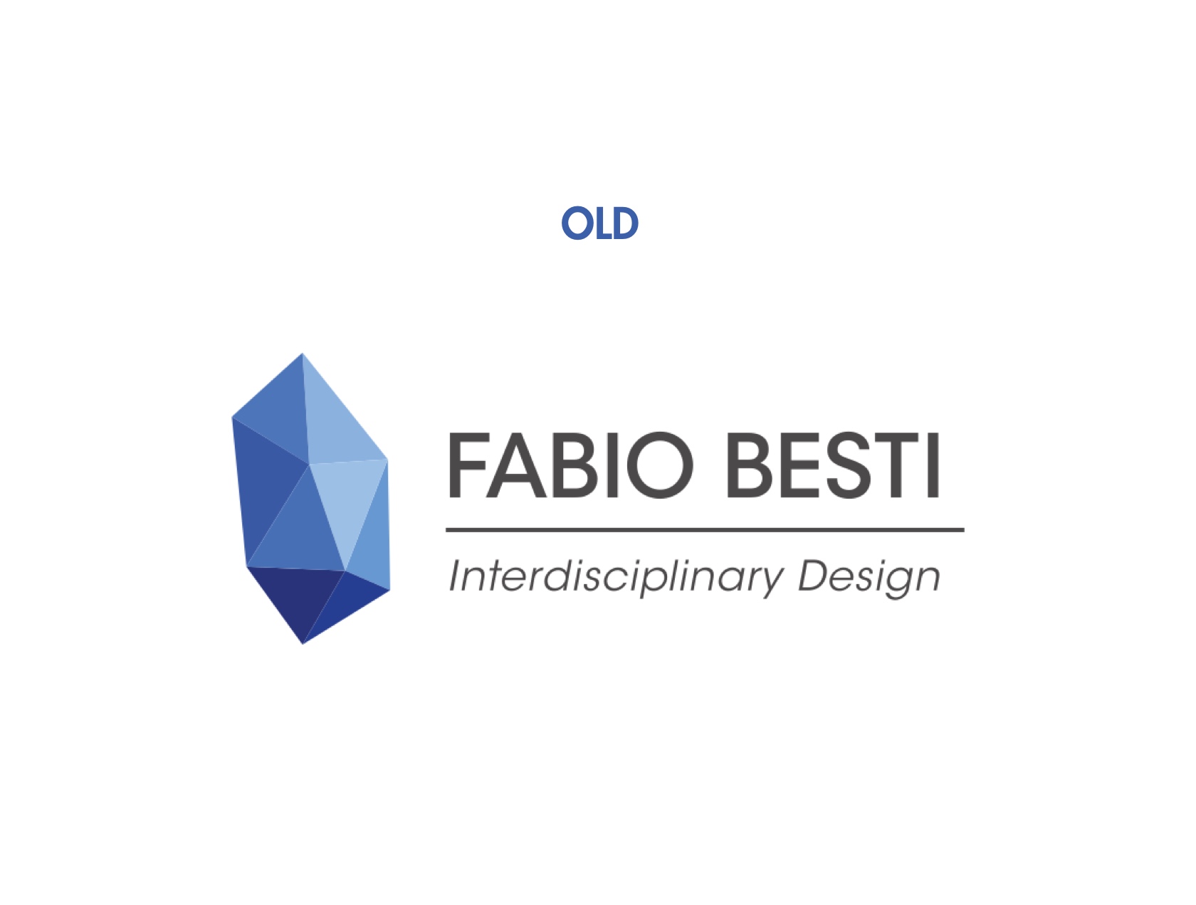
Fabio Besti Interdisciplinary Design has a new logo
A brand new tool for the studio, essential for pushing forward my activities, which over the last years have become more diversified and focused on larger, more international potential clients. The brand new logo design is not only a stylistic operation but a strategic one, aimed at reinforcing the studio and maximize the awareness of the brand between our newly expanded target audience.
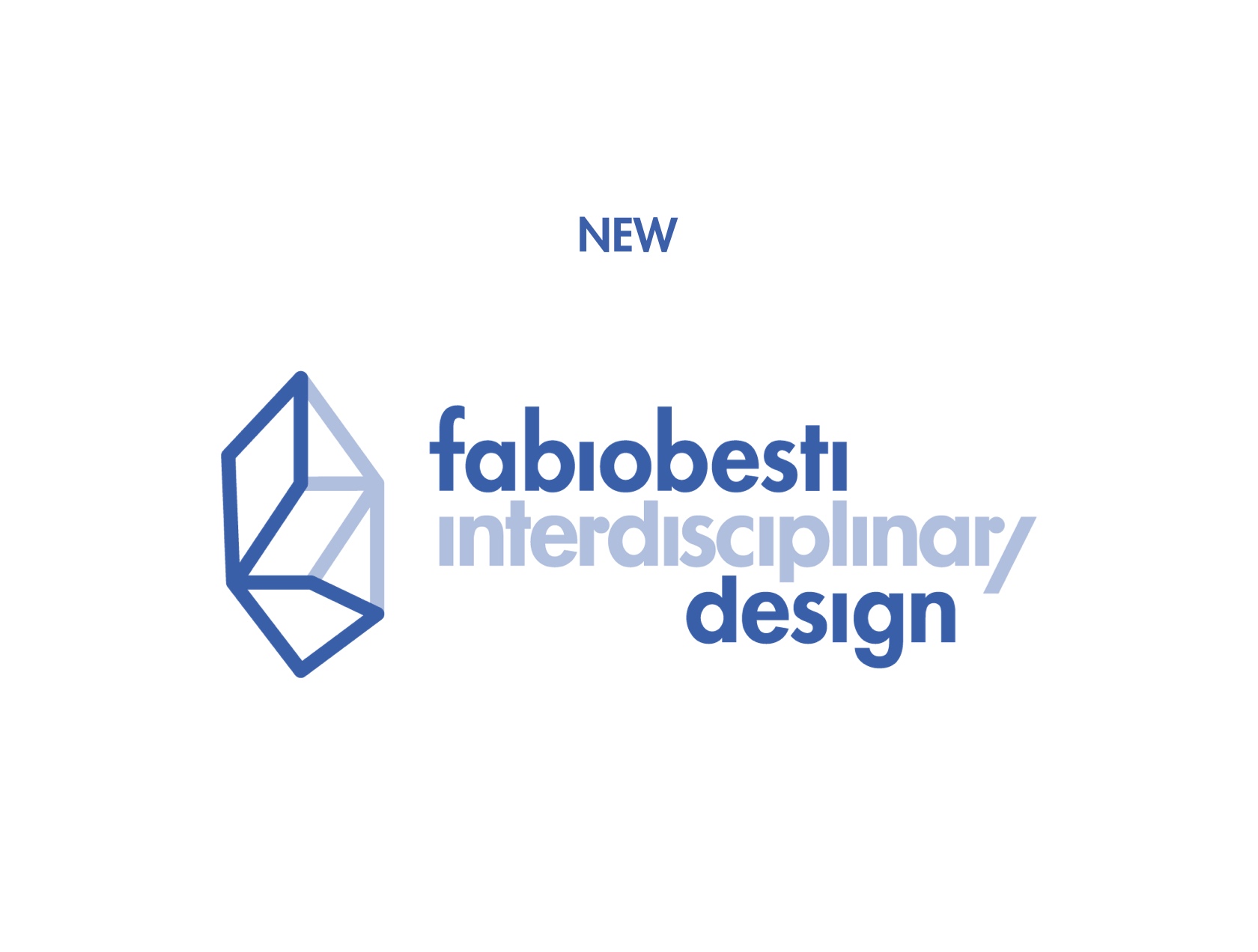
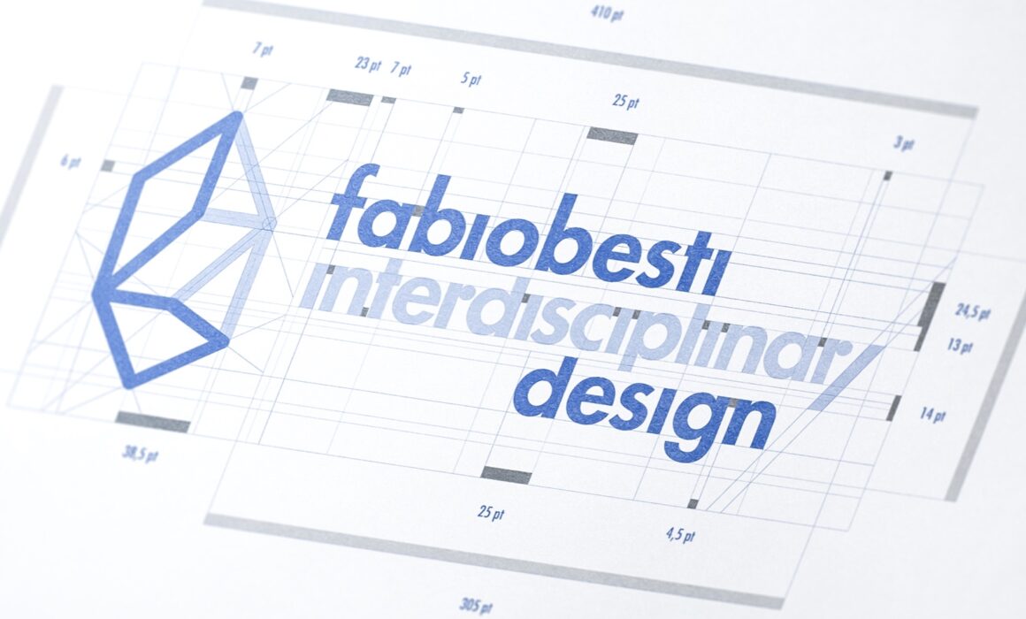
The objective of the redesign is to convey a new-found spirit of harmony, a sense of rhythm: something that we called an effect of “powerful simplicity”. This is achieved by staying clear of graphical trends and leaning heavily on the strength of typography and the use of a minimal and simplified version of the diamond symbol.

But the final solution answers additional challenges. Firstly, the need to be easily integrated into the current visual identity, characterized by the dynamic use of Futura, paired with an extended use of gradients of blue. Normally a common rule would be to avoid the use of the same font in the logo and body-copy; here Futura LT is present in both, but in the logotype, it is also subtly tweaked and customized, and this seems to be more than enough to ensure both coherence and originality to the typographic part.
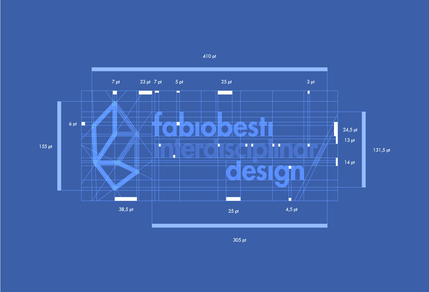
Another challenging aspect that we had to confront was the compactness and scale of the typographic elements; these couldn’t take too much real estate and this is especially true for a logo containing four words. To tackle this, ‘fabiobesti’ was contracted into a single word, following also what seems to be a common way of pronouncing my name (which is quite short and can be spelled out loud with one single breath); the elements, therefore, become three and are vertically stacked by using a variable leading (that ensures both legibility and balance at different scales) and achieve the right visual compactness thanks to an unorthodox horizontal alignment (on the vertical letters “i”, “l”, and “i” of the three words) and thanks to a meticulous customization of the kerning.
To know more about the design and development process read the full case study on Behance.