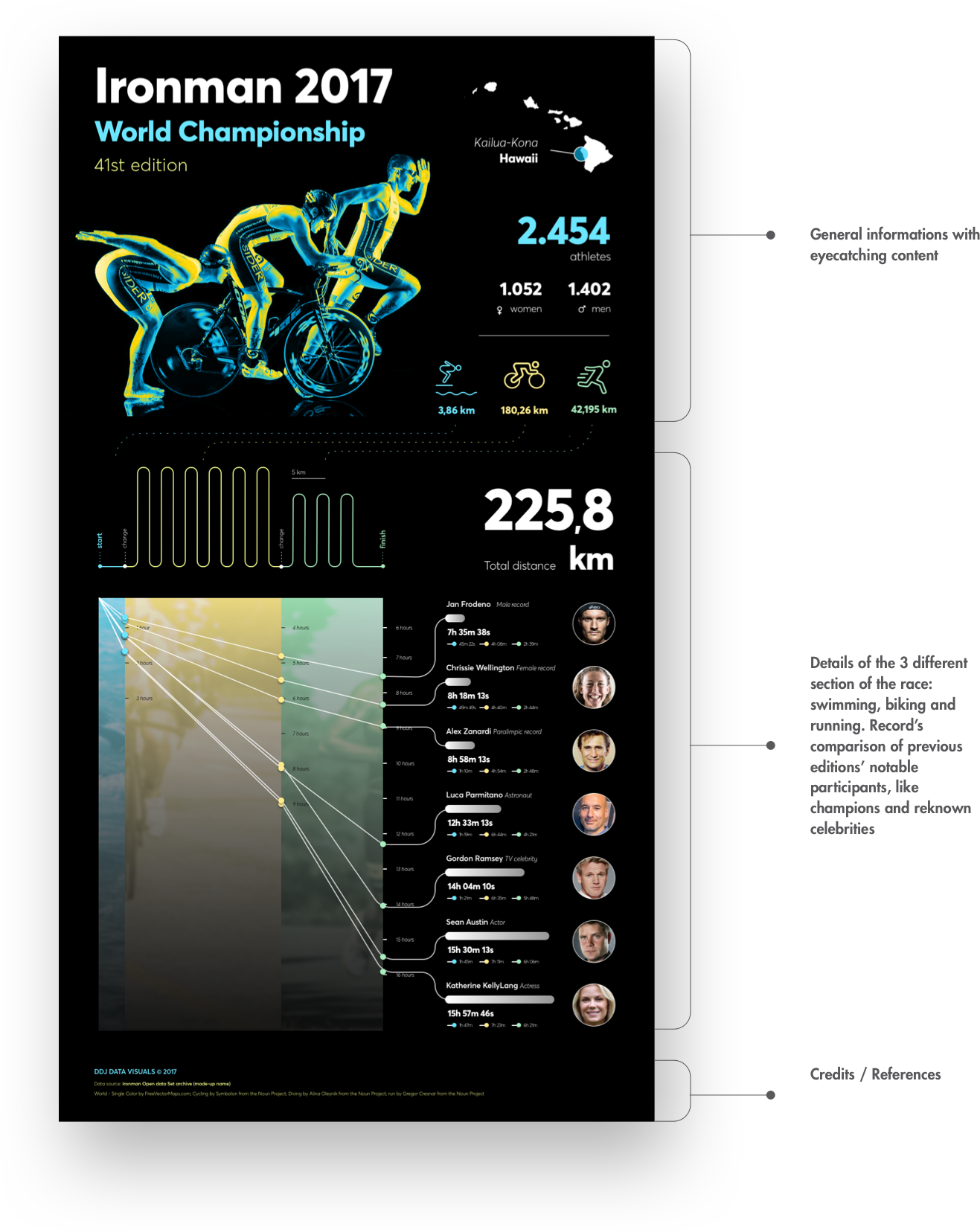
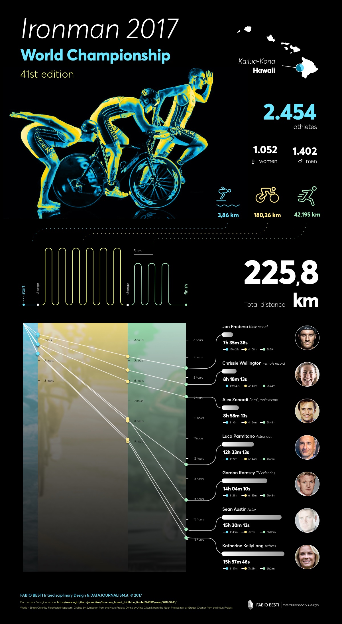
The infographic is one of the outcomes from a preliminary study commissioned by the collective at Datajournalism.it to understand how to take advantage of data visualization for their activities.
Datajournalism.it was born in 2012 from an idea of the jounalists Guido Romeo and Elisabetta Tola and lives today thanks to the work and support of formicablu (a long time client of ours, with whom we worked for example also on Chromic and SMART-map Horizon 2020 European projects). Datajournalism.it works on one hand as an on-line news hub, but it doesn’t stop there as its passionate team also creates and provides contents for other important national news outlets, telling stories that start from data, and use data to connect pieces of experience, information elements, and narratives that focus on people.
We partnered with Datajournalism.it to start a strategic investigation process to understand how to implement and leverage design and visualization in their activities. We conducted an analysis on how the most prominent news outlets use data visualization in conjunction with their journalism activities. The case studies included: The Guardian, Bloomberg, The Wall Street Journal, the BBC, il Corriere della Sera, Wired and many more. This preliminary study informed us on some principles and ideas to design a first concept visualization for Datajournalism with the aim of creating a very flexible format, that would be able to live on different channels, maximizing the power of social media diffusion.
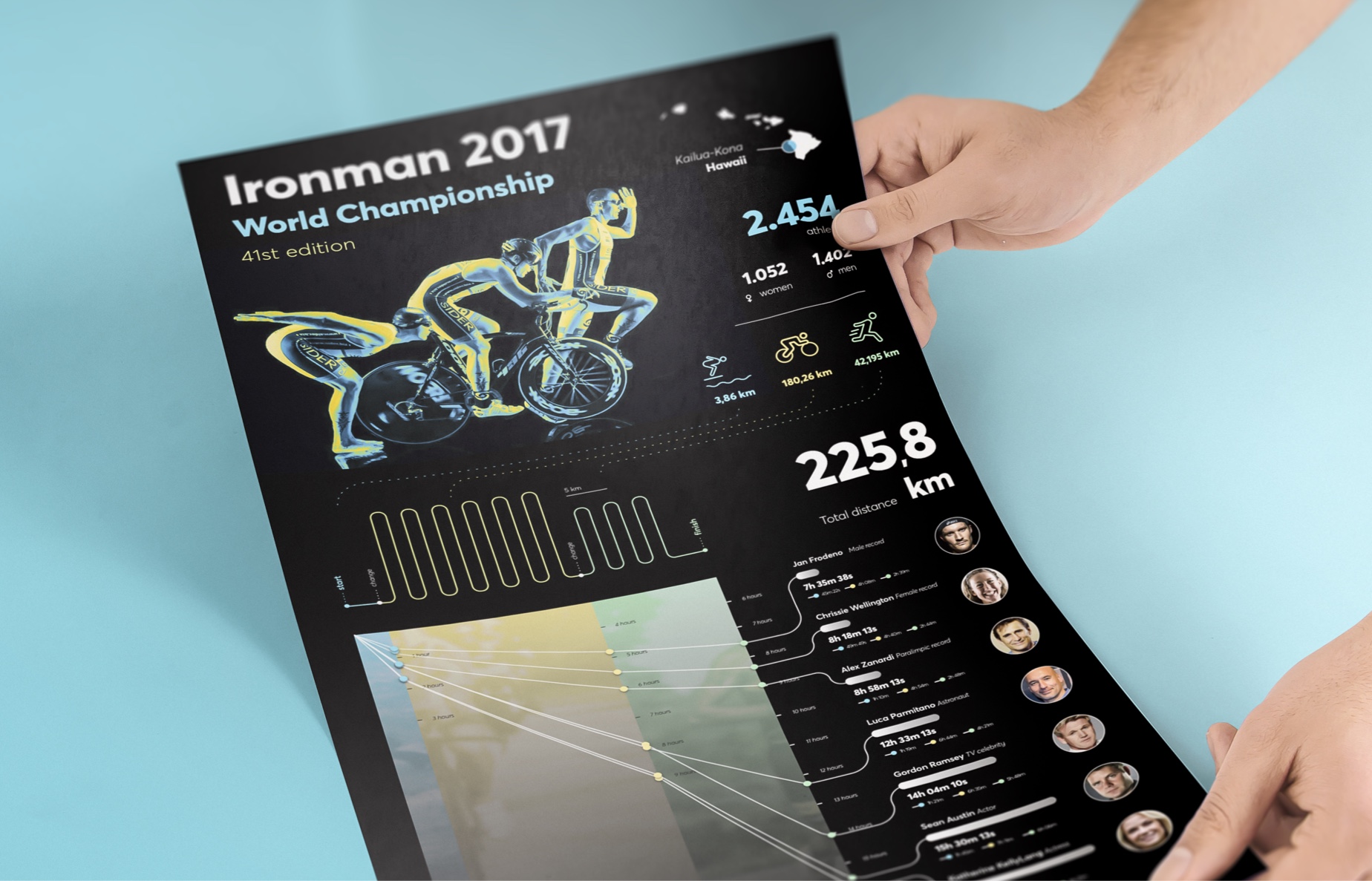
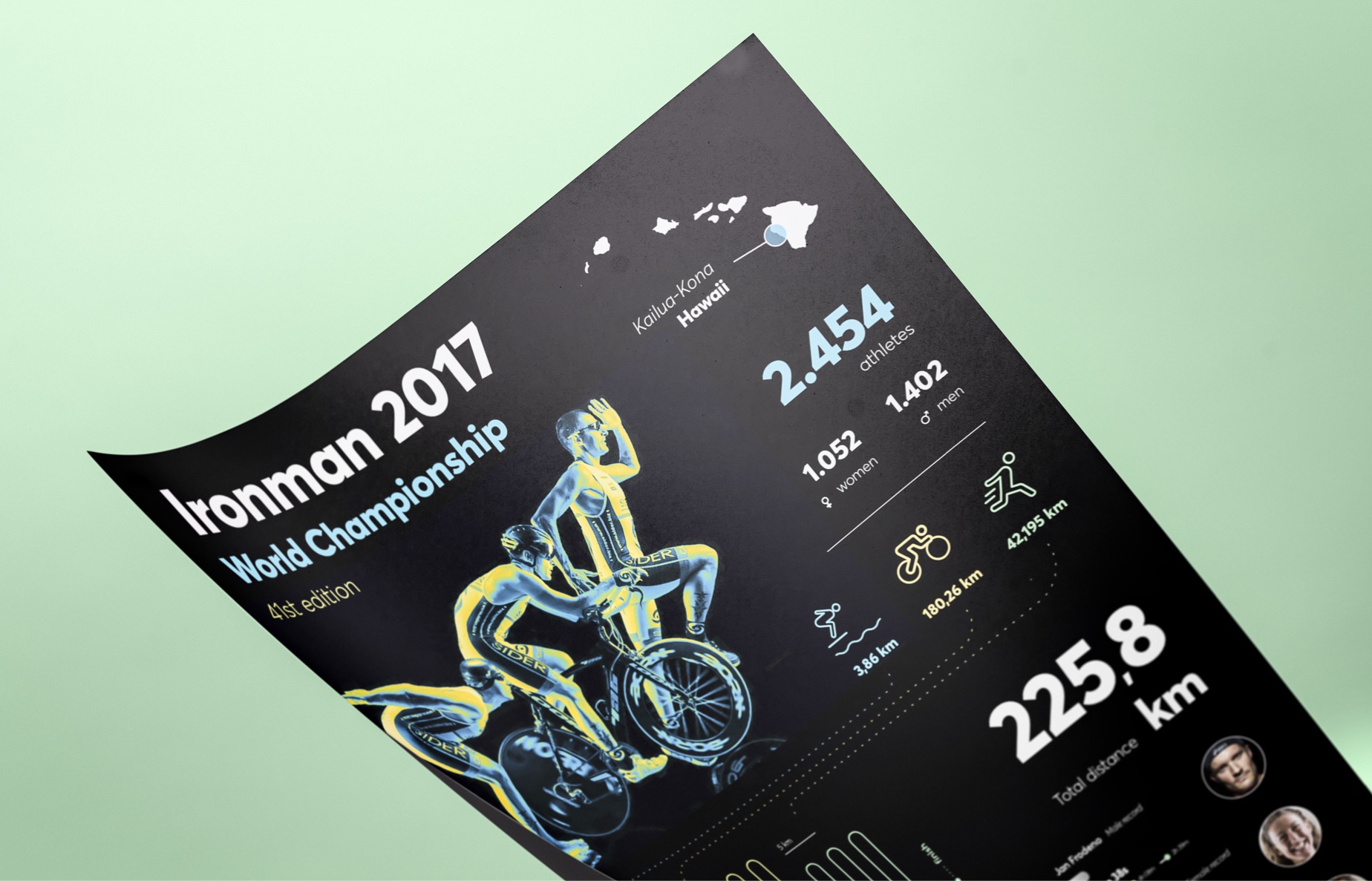
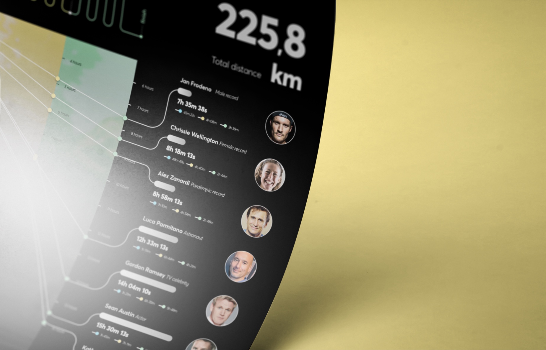
The concept was created in 2017 to accompany an article published by AGI – Agenzia Giornalistica Italia on the upcoming 41st Ironman World Championship, the most important event of the famous long distance triathlon competition, taking place on October 14, 2017 in Kailua-Kona, Hawaii. The graphic artwork highlights the most important informations about the race and visualizes several performances between past champions and world renown celebrities, comparing their records on the 3 different sections of the race: swimming, biking and running. The layout makes it possibile to divide the visualization in two different images and use them as social media cards in order to boost the the social media diffusion and impact.
Social media post – single card

Social media post – multiple images

Bassetti Foundation Storytelling
Discover another visual storytelling
